Crochet speckle
Have you ever wondered: what does a crochet speckle look like? Yes yes, me too, it's an important question. So here you are:

I'm sure that, in between pondering what to cook for dinner yet again and hoovering up crumbly leaves and sand and whatever else the preschooler/dog/cat has stormed in with, you've wondered: what does a crochet speckle look like? Yes yes, me too, it's an important question. So here you are:
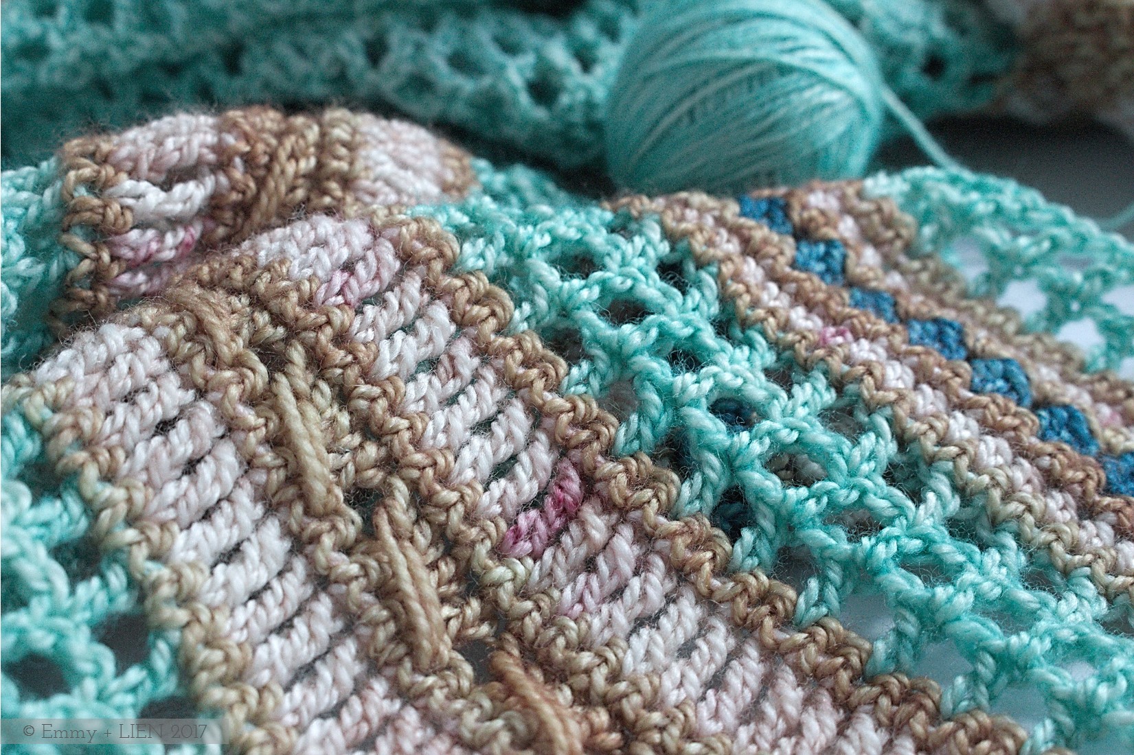
Did you spot it? That little dash of burgundy red? Lovely, isn't it.
But it's also made me wonder, why aren't there more crochet speckles about? Why do speckled yarns seem to be mostly a knitterly thing, so much so that I've even heard mutterings of solid colours being "refreshing" in a "world of speckles and fades".
As a new-ish knitter, I'm new-ish to speckles. I've decided I like speckles. I didn't really come to them entirely of my own accord; It was Petra, the indie dyer I'm collaborating with on a merino version of the Sea Glass Shawl who suggested it with such an air of "well why wouldn't you", that I thought, "well why not?" And now, I like them.

Perhaps the reason you don't see so many crochet speckles is because they tend to feature on socks or fingering weight yarns (the very thin, light ones), and my impression is that crocheters prefer DK and above. Speckles are also a bit subtle - you need tiny stitches to show them off. Are we crocheters just a bit too impatient, a bit too used to our projects growing quickly, to really appreciate speckles?
I hope not. Because I want to re-release the pattern for this shawl soon and more speckly ideas are forming in my head. So at some point (providing the baby ever learns to go without mama milk for more than two hours at a time, but that's a story for another day) there will be more crochet speckle. Just a little bit. It's just too pretty not to, isn't it?


Colour crushing in Devon
Colour, especially of the eyeball-pleasing saturated kind, is a rare thing in Sweden at this time of year. Imagine my delight, then, when our Christmas in Devon this year was surprisingly ...

Colour, especially of the eyeball-pleasing saturated kind, is a rare thing in Sweden at this time of year. As I've mentioned before, the diffuse light and stalking shadows do create their own particular beauty, but the predominant hue is brown. The camera mostly hibernates, just like its owner.
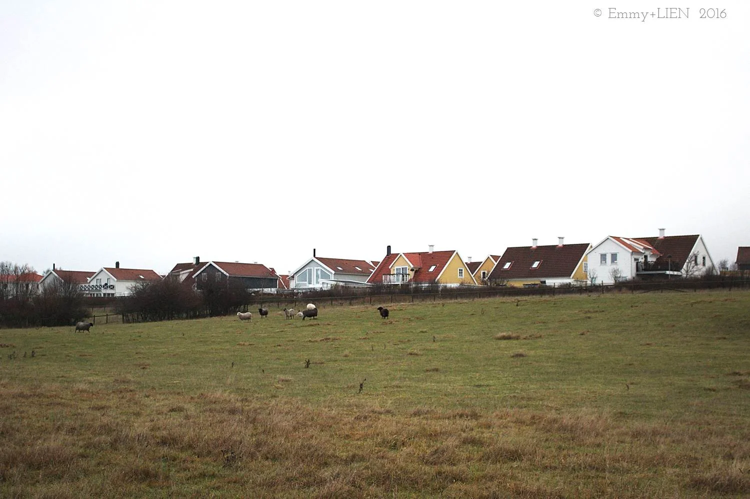
Imagine my delight, then, when our Christmas in Devon this year was surprisingly colourful. Look away from the glitter and baubles and oh! The green was still lush, a few flowers already in bloom, SO many pretty houses and boats.
I'm not sure why I was surprised - although we also live by the coast in the very southern tip of Sweden, a difference in latitude of more than 10 degrees was always likely to leave a bit of a mark on the landscape. And until the post-New Year freeze kicked in, it had probably been a remarkably mild winter, too. Whatever the reason, there was plenty on offer to please the lens.


Incidentally, one colour I can't get enough of at the moment is blush pink. I think it's just perfect for this time of year; soft enough for winter's mutedness but not so subtle you'd overlook it, pretty and uplifting without yet being too optimistically spring-like (we still have a loooong wait until spring...)
It started with a detail here and there, until I went full-on pink socks.
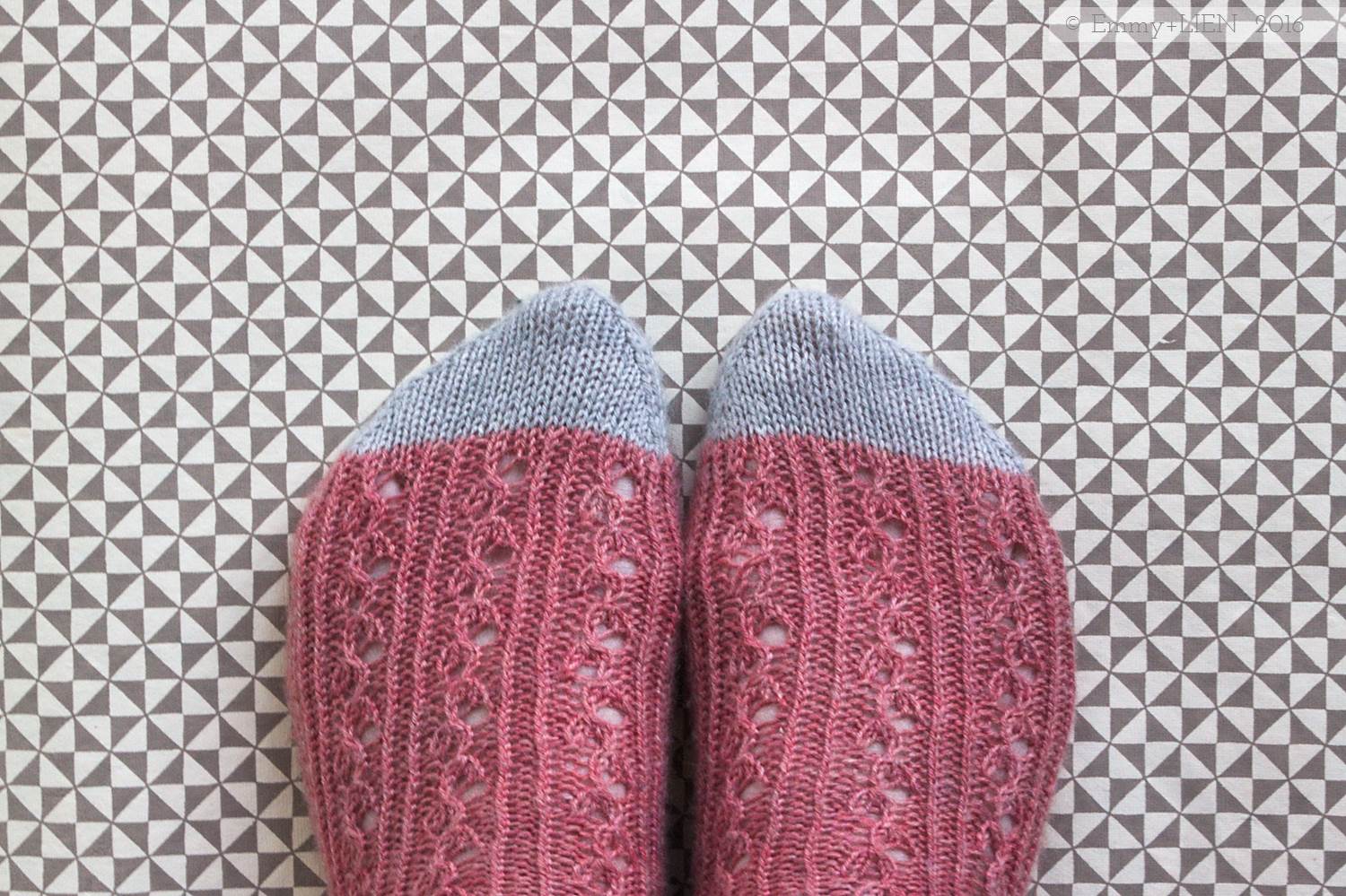
I finished them just before we saw out the year, and I can't stop twiddling my toes and staring at them. The pattern is Aussie Sunshine by Clare Devine, and I used one skein of Coop Knits Socks Yeah yarn in Ammolite as well as a tiny bit of Danburite.
But that is by the by. Otherwise our Christmas was quiet and predictable and safe. We ate too much, played games, knitted. Well, I knitted. When the Bean started tripping on the excess attention, sugar and presents, we hauled him outside to look at the boats with (what I think is) his coolest gift: a pair of pocket binoculars. Proper ones, too, not toy ones.


I also made him his own Lomma Hat, a two-tone version that he surprisingly wanted without a "pompy" on top and didn't take off once all Christmas day. If that red looks a bit lurid, that's because it is, but he marched into our local yarn store and picked it out his very self, so I wasn't going to argue. Foolishly, I argued over how many consecutive slices of M&S penguin-shaped sponge cake were acceptable instead.


I love Brown. Really, I do.
Just a week to go until Midwinter, and the light starts to creep back again. It will help. It's hard not to get bogged down in darkness and murk at this time of year, isn't it? We live in the very south of Sweden, the agricultural rather than the forest and ...

Just a week to go until Midwinter, and the light starts to creep back again. It will help.
It's hard not to get bogged down in darkness and murk at this time of year, isn't it? We live in the very south of Sweden, the agricultural rather than the forest and lake-covered part. It is utterly glorious in the summer, but our winters are damp, grey, and muddy. Occasionally we get snow or a really crisp, blue-sky-and-winter-sun sort of day, but not that often. Definitely not often enough.
Still, when there's an almost-4.year-old who desperately needs some exercise, we do as the Swedes would: don the waterproofs and woollies, head out there.
I took my camera too, fully expecting to leave it in the bag for the duration of our walk. There would be no colours to light up my heart and lens.
But it turns out there's beauty in brown too, if you look hard enough. A little haunting, quite skeletal, very damp. But beautiful. All right on our doorstep, and we even found some treasure to take home. Where my colourful knitting was waiting, as always.


Sea Water, Sun and Yarn
Now the autumn/winter proposals have been handed in, it's time for a little late Spring sneaky peeking. Add in a mini yarn review, "sea water" and "sun", and it feels like we're heading for a great summer.
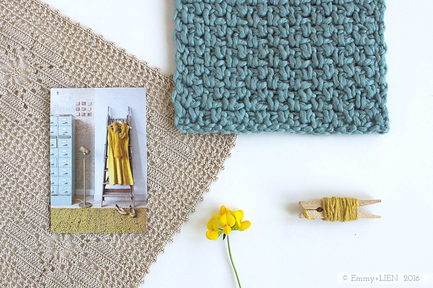
Yesterday I handed in a stack of autumn/winter design proposals. Now I just have one or two more things to try out for the Emmy + LIEN label, and then I think I can draw a line under all things dark and wintry. Only until the sample making starts, of course, but the initial head-scratching part is done. The result: a stack of swatches. About a month's worth of work. Doesn't look like much does it?!

One late summer design has snuck in there, and I wanted to pull it out for a little sneaky peek. And a yarny drool.
Meet my new crush: Pickles. They're based in Oslo and, oh my, don't they ever produce deliciousness. I ordered two types (for now!), Summer Wool and Thin Organic Cotton.

Summer Wool consists of 70% organic cotton and 30% fair trade Peruvian merino. Plant-dyed, entirely scrumptious, and swiftly set aside for a knitted cardigan for Yours Truly (more on that another day).
Thin Organic Cotton isn't actually that thin - it works up almost like a worsted weight rather than a DK - but it is very lovely. It feels much softer than 100% cottons usually do, and so it's perfect for a summer to mid-season vest design I've had in mind. Though I normally get lead times spectacularly wrong, this *should* be coming out fairly soon. Swatch done, colours picked, mood board fun had. First test subject: the Bean (though I think it'll be a child to adult pattern - I want me some of this too!).

I'm waiting for the rest of the yarn I need to make up the sample to arrive. I settled on this muted "sea water" blue, and added a yellow called "sun". Sounds like a perfect summer of making to me.
Just so you know: I have not been compensated in any way for writing this post.

A Yarnie's Take on Pantone Colour of the Year 2016
If you've been keeping track of my designs you'll know I'm not really a pastels sort of girl. After some yarn and cup faffery, however, I figured out how to make Pantone's pick for 2016 work for me.

In a first, Pantone has picked not one but two colours as Pantone Colour of the Year for 2016: Rose Quartz and Serenity.
If you've been keeping track of my designs you'll know I'm not really a pastels sort of girl. I don't dislike them - I just think their subtlety is a bit lost on me! As with all the colours Pantone picks, however, obviousness is not part of the game. What matters is your own interpretation and it's fascinating to see what designers, stylists and artists across the world come up with (you can keep track of all that on Pantone's dedicated Pinterest board).
To figure out how to make Rose Quartz and Serenity work for me, I decided to just have a play. A hint of yellow, my favourite notebooks...

The yarns pictured are by Vinnis Colours (blue) and MoYa (Pink), both kindly sent to me by Scaapi, and Sirdar (yellow). Although I don't think of these colours as "me", I do really like the softness of the picture and I think the palette would be beautiful for a crochet blanket or a delicate shawl.
Still, more colour faffery was needed (I know, my job is really hard). As I rearranged my cups and yarns it suddenly clicked:


pastels + neutrals + bolder colours = Ombre! Ole!
I really, really like this palette. I'm still thinking about what to make with it - any suggestions? - but whatever it is, it'll be fun. The pink yarn is by MoYa, as above, and the coral yarn is by Nurturing Fibres. The jute rope is one of many rolls I picked up at a gardening store!

How are you approaching Rose Quartz and Serenity?